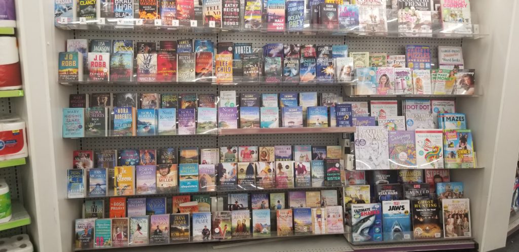
Today I found myself “stuck” in a drugstore for fifteen or twenty minutes. I decided to get some steps in, and began walking around the perimeter of the store. Lap after lap. Until I stopped at the books. Something was talking to me about this display, but I wasn’t sure what it was. So I stood there, looking at it for maybe a full minute until, suddenly, it struck me.
First, though, take a look at the display yourself.
Make it bigger if you can.
Stare at it. Do you see what I saw?
Look at these covers. Look at the fonts. Almost all of them are simple. Bold. Good contrast. Very little frill, almost no flowing bits and edges to the words. Simple. Mostly sans serif. Easy to read.
Even the romances, right?
I mean, the Bridgerton books are all over this display—hardcore regency romance—and you don’t see any “soft” or wild, flowing fonts here.
Thriller. Contemporary literature. Action. Mystery. Suspense. A bit of Western flare. There are a lot of genre’s here, but the use of fonts in these books are all quite similar. No frills. And the one or two books that do show some extravagance in their titles are actually being sold by the author name—which is then displayed in simple, high-contrast and easy to read fonts (I’m pointing at you, Afraid!).
When I got home, I went to Amazon’s list of best-selling romance to see if this was an outlier.
Historical romance? A little flare, but not much—and again, there’s almost always something easy to read there.
Fantasy gets a little fancy at times, but still not too much, really. And again, look at readability all down the line.
This is what I’m pretty sure stopped me at that display. I’ve been fiddling with covers and other graphics stuff the past few days, so my brain is in that space so consider me to be preconditioned in that direction. But I think there’s a lesson to be had in this thing that stopped me in my tracks.
Maybe it’s just me, but if I have a choice in my future designs I’m going simple on the fonts.
